Anna Eagleman
Graphic Designer
Hello and welcome to my portfolio site! I'm a graphic designer specializing in logo design, UI design, and illustration. Let's bring your concept from idea to reality.
Designs by Anna
About Project
Hopeful Horizons is a coaching program designed specifically for those who are going through or have completed cancer treatment. Coaching is also provided to spouses, family members and other caregivers needing support during this challenging period.
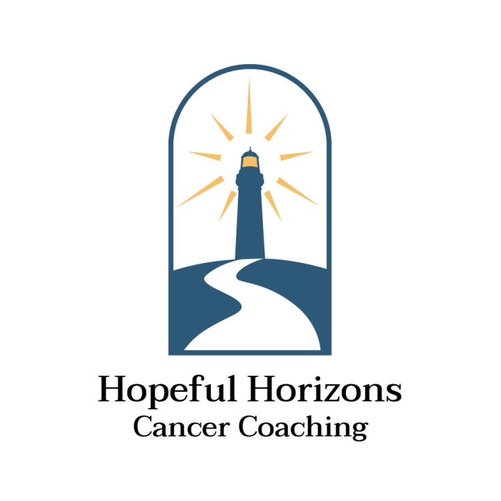
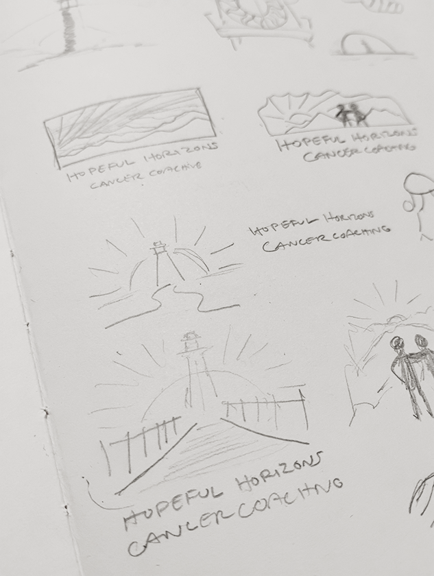
The design prompt was to design a logo to be used for Hopeful Horizons coaching program. The logo should represent the program as caring, comforting, and in a positive light. Use calming blues. Use symbols like lighthouse, water scenes, or something geometric.
The resulting design uses the depiction of a light house on top of a hill with a curved path leading upward to the shining beacon. A shining lighthouse reminds us of hope, light, direction. The lighthouse provides a way to safety when we feel lost and is a place to bring us closer to others for help. The path is curved as there is not one fast and straight path for healing. The lighthouse is framed in an open door to represent welcoming and open environment. I selected a deep blue green like deep ocean waters or the night sky to contrast with the warm yellow light of the lighthouse.
About Project
Couch Family Farms is a family-owned chicken farm that sells chicken eggs.
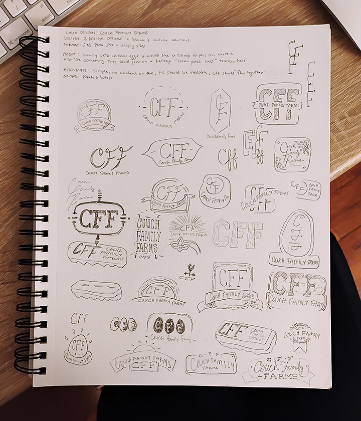
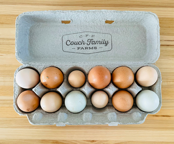
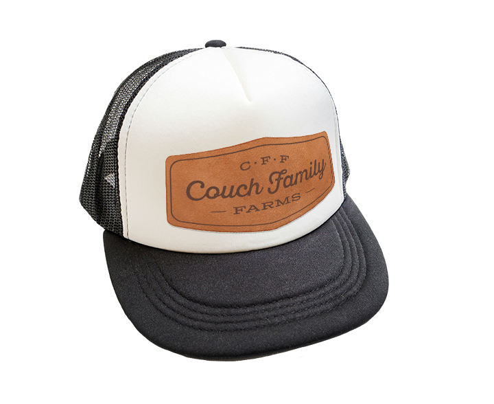
The prompt was to design a logo to be used as a stamp on egg cartons in which the Couch family will sell their farm-grown eggs. The logo should also work as a leather patch design for a ball cap. The logo needed to be simple and include "CFF", F's should be readable, CFF should flow together, no chickens or eggs.
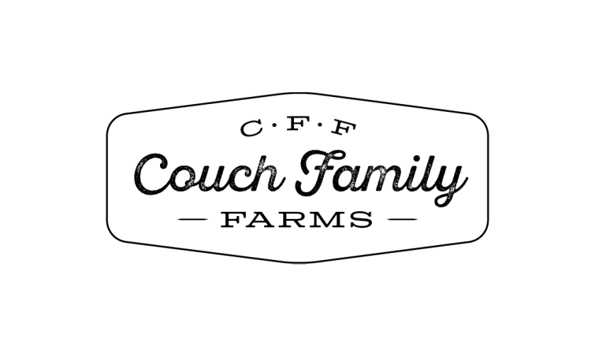
The design is simple with a touch of rustic texture to give that country farm feel. The chosen fonts support the home-grown quality vibe with a script and slab-serif pair. I wanted to avoid the "CFF" part of the logo mistakenly reading as "OFF" and decided to feature the name "Couch Family" with the initials smaller and separated by bullet points to emphasize the separate letters. When a customer sees "Couch Family" on the egg cartons, they immediately know whose farm the eggs are from.



Personal Works